Friday, 18 April 2014

Target audience feedback from the magazine cover and poster

 We uploaded our magazine cover and our poster onto a social networking site called Facebook. By posting our magazine cover and poster on to a social networking site it allowed us to have access to a numerous amount of target audiences as well as our desired target audience. The feedback from the comments in which we got were pretty much constructive criticism which helped us as a group as we were then able to develop the magazine cover and poster to what our target audience wanted so the outcome means that it will be a better product.

Some of the comments in which were given were;

  • The poster is too dark, it needs to be brighter so that it is more eye catching
  • The magazine shot is too far back, there is too much background and its not focused on the characters
  • pay attention to the small details within the layers of editing as this will help with the color composition as well as the saturation levels which will improve the professionalism of the product.


Friday, 4 April 2014

Evaluation 4

How did you use new media technologies in the construction and research, planning and evaluation stages?


 When we started to create our products and presenting them we used many different technologies these ranged from applications used on sites as well as software's on the macs which include Blogger and GarageBand.  New media technologies have been used from the very beginning from planning and research right the way through to the evaluation.  These range from Apple's Mac to Adobe softwares, Mac's were our main source to other programs simply because of their design, they are created for creative use meaning we could be more experimental with our products, as well as giving them a different perspective as we aimed to challenge the conventions of a war film.


     Microsoft office consists of programs such as PowerPoint, Word, Excel, Publisher etc.  These are all programs people use in their everyday lives including for their leisure as well as business use for their occupations and we decided to use them in many different stages of our projects due to the ease of use and familiarity of the programs within the software. For example I used them for when i was researching my target audience and so
 I used Word to create my target audience questionnaires,  this then gave them a professional look and kept the layout neat. For my results of the questionnaires I used a combination of PowerPoint and Excel to create a range of graphs to show the responses to my questionnaire results By using PowerPoint this then allowed me to use it to be able to present for the charts and Excel allowed me to easily input the data and create the graphs in which I needed.  This was helpful when extracting the useful data for future decisions. 
     Using Microsoft Office and its applications as a group gave us a huge advantage as within the group we have two members who study ICT - One being my self,  and all of us have some experience with the programs, it meant we could use the software easily and didn't feel limited by the lack of knowledge. 


     Once we began to create our trailer we decided as a group we would use Final Cut Express  to put everything together as the program was more professional and allowed us to have more of a creative perspective over what we do to the footage.  Such as cutting footage, deleting audio, adding extra audio, combine visual and audio elements, apply filters, change the size of footage etc.
     A reason for us choosing Final Cut Express over iMovie is because of the higher professional level the program is on. This is because Final Cut Express is used widely in the media industry and is particularly popular with people who do video blogs also known as vloggers and many other professionals in the business.  If professionals use Final Cut Express then we are more likely to make a higher standard film with the same effect as them.
     Final Cut Express had more pros to offer us than cons, however we came into contact with a few issues when using the program.  An example is that the camera's that we were using we had to import footage through iMovie and then export it to XML.  This was time consuming and downgraded the quality of some of the footage, it also meant we had to teach ourselves how to convert it again.  Although once you get used to the program it is fairly easy to use, teaching yourself is rather difficult as you have to search very specific things and sometimes can't find sufficient tutorials.


     GarageBand was an extremely useful software in which we used to create and compose the soundtrack for our film trailer.  By using GarageBand this then allowed use to use a wide variety of sounds, from Apple loops to downloaded MP3's from the internet, adjust the pitch, tone, tempo etc to create a smooth track that suited our kind of film.  The software allowed us to time the music perfectly, shorten or lengthen loops and make the sounds match up to certain parts of the trailer for dramatic effect.


Both  of our ancillary tasks ;our poster and magazine cover were made in Photoshop from start to finish, it allowed us to correct multiple things such as;
    lighting, adjust colors, crop and re-size, clone, add layers, add effects, text extra photos etc.  
All of Photoshop's tools were extremely useful, we could zoom in and change even the slightest of details, we cloned areas of the tree to cover the sky, added a vignetting effect around the edge, removed blemishes, warped certain images to change the shape, erase other parts and more. 


Trailer


Evaluation 1

In what ways does your media product use, develop or challenge forms and conventions of real media products?
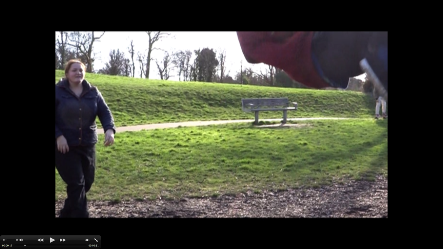
 By looking at this first screen shot you can see a variety of scenery as well as the props in which we used in order to create the desired atmosphere. Within this screen shot you can clearly see that we have already used a park which was located within the medway towns, which was also contained some climbing and activity aparatus. We used these to our advantages with training and the before 'happy' life. When I was carrying out my research for my trailer research blog I did not once come across this scene or use of such camera skills within one scene due tot he genre. This is because the genre we have chosen does not typically start with something happy or as calm as this, so we challenged the conventions of a typical war genre trailer just by composing this scene and including it within our trailer.
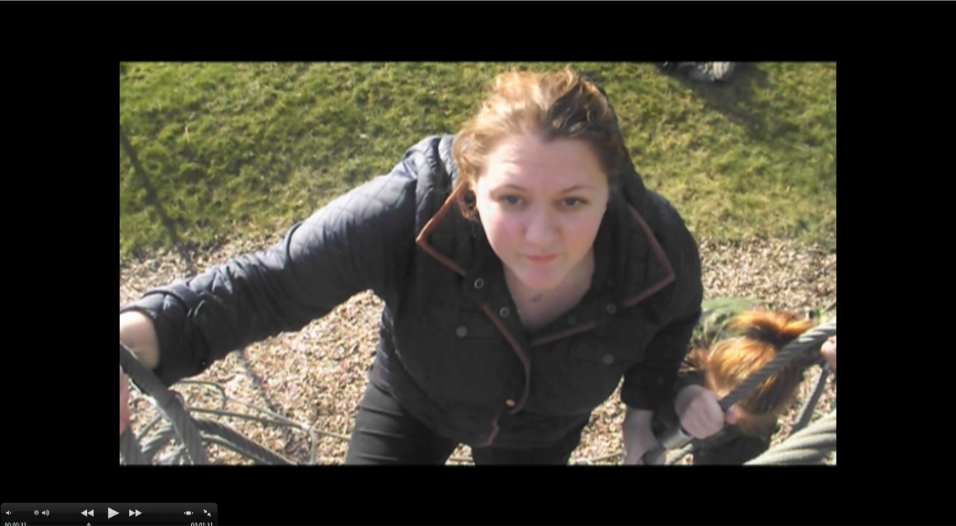
By looking within this screen shot it is clear to see that we have used a variation of shots within our trailer. This is because of the type of atmosphere of what we wish to create for our target audience. The reason why we used this shot is because by the camera angles at this position it makes it look almost like it is something in which they are trying to reach, like a goal in which they desire to accomplish. The reason for using this shot is because of the symbolism in which is has and the way in which it can be related back to the plot of the film. This is because the aim of the plot was that females were going to be fighting in the war, so within this shot we have included some key parts of the symbolism which is that there are only females within the shot who are aiming to have achieved what they set our to do- win the war. This scene is quite particular within films, especially action and war films. This is because they usually have the plot of having to achieve something or to gain a certain aspect of the film for the target audience to be intregued. BY having such a common shot within our film we though that maybe this will help our trailer be less marginalised from other films with similar aspects. But the outcome in which we wanted was for our trailer to be different and unexpected which would excite the target audience and create an interest for a 'forgotten' genre. This shot also shows the costumes in which one of our characters wore which was simplistic but yet effective dark navy and black which was best for camouflage and consistency throughout the trailer.
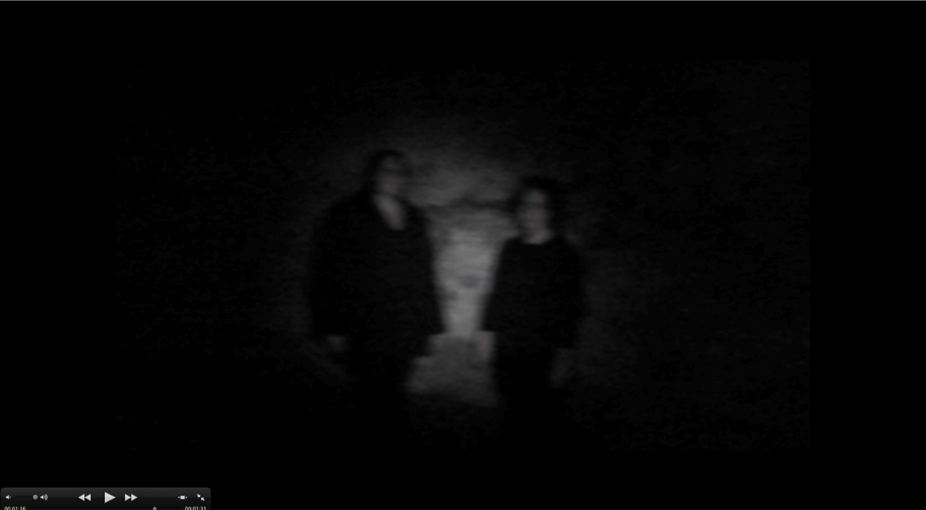
This shot which we have included within our trailer, was something which is commonly seen within horror and psychological thriller films, so with this shot we decided to challenge the conventions of a war films by having some aspects of the film linking and converging between a number of genres. The reason for this is because we wanted to interest our target audience and grasp their attention at the edge of their seats. The camera work in which we used within this scene is slightly different than the ones in which we have previously within the trailer, this is because we wanted to show people that we knew what types of camera shots there were as well as what they could do in order to create the desired atmosphere for the war genre. The outcome of this is that there was not as much of an effect as what we anticipated, this is probably due to the fact that the people who we asked to watch the film were not lovers of a war film so they probably had bias opinions about the trailer which made it an unfair judgement.
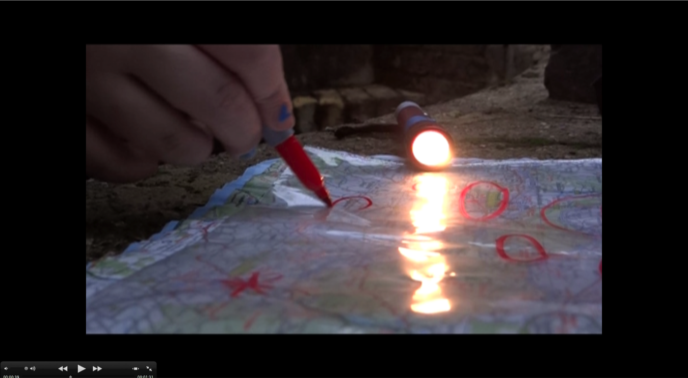

This shot simple shows the map and the torch which we used as props to show where the enemy was attacking and where as well as to show organisation within the war genre and how certain things can be anticipated. This scene has been found on countless occasions within war films, but however they are usually on a larger scale with ships, tanks and planes where as we are more on a ground location so by marker out where the enemy are placed. This shot is commonly scene within a various number of films so it was no surprise to some of our target audience feedback saying that this shot looks like something they have seen in some other movies which have war related scenes.
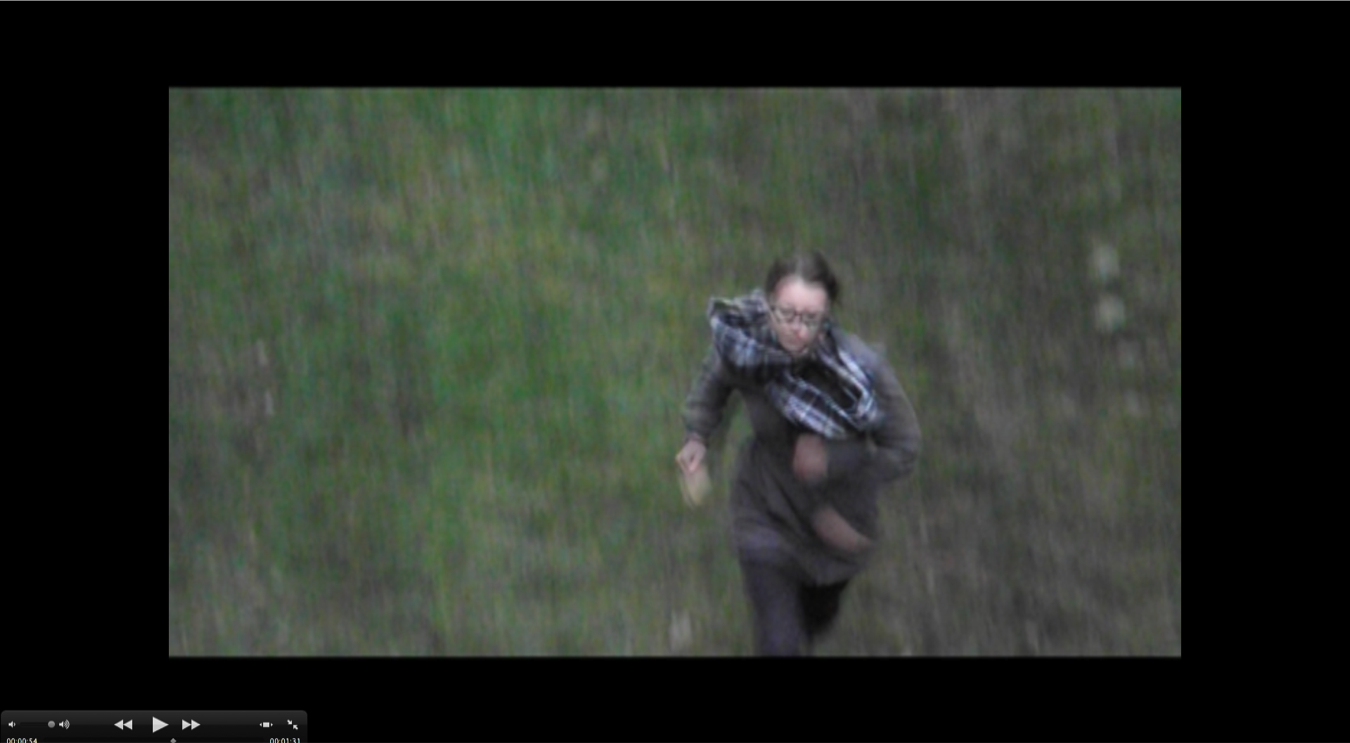
 This scene shows emma running down the trench, running away from something or someone. We decided to include this shot because we have used a variation of shots within our trailer to attract our target audiences attention but with the use of this shot we can see this scene from a different aspect, possibly the enemy's? We decided to include this shot on purpose because we wanted to give the target audience the opportunity to have their own perspective of the film as well as from who's point of view they will be looking from and into.
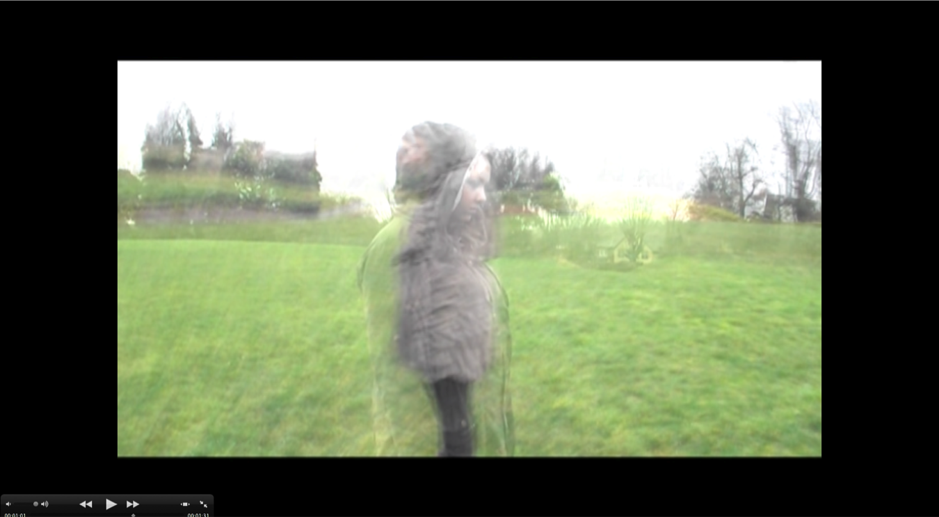
 I took this screen shot of my trailer because of the effect of all of the transitions and the camera work combined. This is because when singled out both pieces are nothing more than footage but by combining both of the footage together and with the use of some transitions from Final Cut Express we was able to make the two pieces of footage over lap and interlink with one another perfectly to give that kind of hallucination feel to the trailer which links in with the plot, is the war happening or it is a mental fatality causing a repercussion of an individual. The camera work which was included within these shots were mostly panning shots to help give the atmosphere of hallucinations and the concept of being lost and confused at a stressful time within society.
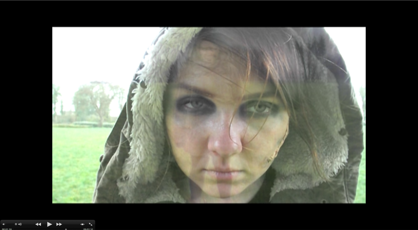
 This screen shot shows that I have combined two different shots by having a useful editing tool called transition, which I was able to include within Final Cut Express due to my knowledge after watching some clips on Youtube. The camera work that I have included her are an extreme close up of my face to symbolise the impact in which something so serious can happen and the consequences of rivalry. This shot also holds some of the most vital aspects of the film, this is because this one shot involves the location, the setting, the costume, props ( the liquid latex) and the camera work and editing. This is all something in which I have not seen before within a war film. So we have challenged the conventions of a war film because I never seen these combinations of such techniques and ability to have so many skills combined within one shot.
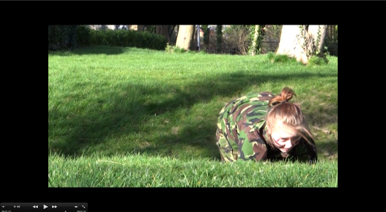
 This shot shows the setting, location and the character in costume with the use of blood for emphasis on the props for resemblance for the target audience for symbolism about what has happened without actually showing what actions went down. This is also quite a common scene within the war genre of films, this is because it is almost shown in every film after the main character of the film is hurt or injured and they are trying to find their way back home. So it turns out to be a quite generic scene in every war film so it turns into a homogenised scene for war films. Within this screen shot you can also see that the use if the camouflage army kit has helped to blend into the background which would have helped many people during the war.
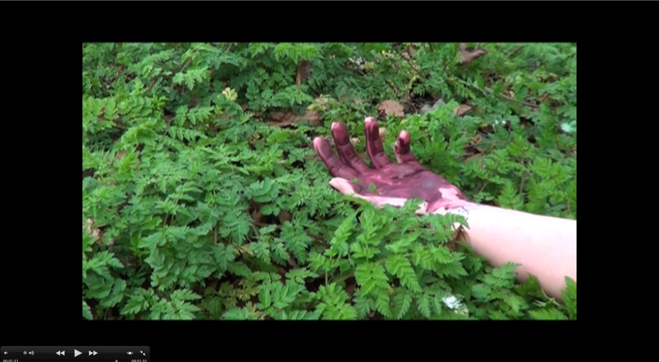
 This screen shot was taken because it shows the use of props within the film as well as the use of scenery which we used a field near to the school for easy access and location during school hours for shots in which we can do at anytime. This shot shows a resemblance between the shot above and the plot of the film. This is because of the link between the background and the blood.  The blood helps the target audience to be able to have some questions bouncing off of their minds about what happened, who did it happen to, is she dead, is the war over. All of these questions will cause speculation between one another and then the target audience will have an interest to watch the rest of the film.
 These two screen shots are off the title and the coming soon scene within the trailer. These are the most common thing to find within a film trailer, this is because each film trailer must have the film title included so that the target audience can look out for the title in the cinema and on the shelves in stores for buying it on DVD. This is completely the same for all real media products. This is because every film trailer consists of these two scenes.


Thursday, 3 April 2014

Evaluation 3

What have you learned from your audience feedback?

I have learnt a variety of different things about what audience feedback can do and how it can influence choices. 
  

  When we started to make our film trailer  and the two ancillary tasks we had to decide about how we were going to incorporate the target audience within them as well as what suggestions that were going to provide us with. And so this is why we created audience questionnaires and collected the relevant data so that we could  find out what is  the most likely target audience for us and the promotional package as well as to do research about what type of person will have the right audience portfolio to want to see our promotional package. The audience feedback allowed us to examine and see what types of individuals are most likely to watch our film and who our target audience is, once we collected this data we were then able to create an audience portfolio. This then meant that we were able to make changes and develop certain aspects of our poster, magazine or trailer according to the responses and feedback from our audience, mostly it was a comment saying about how we could improve our products to make them look more professional. All of our feedback was delivered to us as a group through a varied range of social networking sites and social media sites such as Facebook.

  When creating and assembling our trailer we got feedback from our target audience within the school as well as some constructive criticism from other media teachers and some photography teachers.  While they were watching the trailer we decided to ask them that at the end of watching the trailer, to give us good and bad feedback as this will help to develop the product into something more effective and possibly reach our target audience with the most appropriate angle. However due to quality of the film when uploaded onto blogger we were unable to get accurate feedback due to the lack in quality, what this meant was that we were unable to use this feedback . Also because Jess's brother was in the film trailer she didn't want him to be on social networking sites due to him being under a certain age as well as for confidentiality reasons. There wasn't as much negative feedback that we got the only thing we did get told was that they would like to see some blood scenes and some gory parts to make it look like some thing bad had happened and that someone had got injured. So we managed to get this Incorporated into our trailer near the end.


Wednesday, 2 April 2014

Evaluation 2

How effective is the combination of your main product and ancillary tasks?

My opinion about how effective the combination of our promotional package is that the overall effectiveness of the package is what I imagined. This is because the package is innovative, unique, outstanding and it is an exact replica of all of our strengths within the group. Personally within the group we had Emma who was more confident doing the music and photoshop side of things, this is because she was more mentally knowledgeable about the Softwares and their advantages of the outcomes. We had Jessica who was more confident with filming the footage and using Final Cut Express and then we had my self, where as being my self as such a flamboyant character I was more comfortable being in front of the camera and the use of Imovie. So as a group we made the best of our strengths and we combined them all to reach our goal in achieving this promotion package.

The type of promotional package in which we wanted to create was going to be targeted at more of a niche audience. This is because the war genre is most commonly targeted at more niche audiences, for example Pearl Harbour was targeted at the small target audience range of 30-45. The reason why we decided to target a niche audience is because of the more in depth in which we can go into for the individual them selves as well as predicting the outcome of the package.